
An open invitation.
One rounded claw. A clear, living channel. The approved silhouette and custom wordmark work together as one precisely spaced signature.
 926.295 u · total width50 u minimum clear space
The relationship is the logo.
The icon is deliberately larger than the letters. Its centre sits against the capital-height centre, balancing the upper mass and lower pincer. The gap is fixed; the wordmark is outlined artwork. Use the supplied files and scale the whole signature together.
- Reference capital height · H
- 100 u
- Icon height
- 1.65 H · 165 u
- Icon ↔ wordmark gap
- 0.38 H · 38 u
- Clear space, each side
- 0.50 H · 50 u
- Full artwork width
- 926.295 u
- Full artwork height
- 165 u
Units are relative construction units, independent of output pixels or millimetres. At a capital height of 20 px, the icon is 33 px high, gap 7.6 px and clear space 10 px.
Loading master measurements…
Every space has a job.
These are the measured gaps in the approved eight-letter wordmark, not a tracking setting. Round capitals overshoot by 2 u; lowercase rounds by 1.2 u. Straight and curved forms look aligned because their outlines are optically adjusted.
The channel stays open.
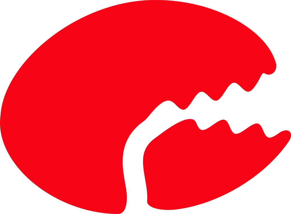
A natural joint, not a horizontal slice.
The S-shaped channel follows the pincers. Its central measured normal separation is 7% of icon width. Three upper teeth and two lower teeth establish a deliberate rhythm.
Preserve the full 22° opening, rounded ends and transparent channel. Do not fill the gap, add texture to small marks, redraw the teeth or rotate one part independently.
Proof at the final size.


Start at 32 px for the standalone icon and 180 px for the signature. Test the actual reproduction; embroidery, low-quality printing and small screens may need more space. These are proposal starting points, not universal minimums.